

Etsy
Whatever it is, the way you tell your story online can make all the difference.
Project overview
Goal: To create direct clear communication between vendor and buyer when dealing with custom requests and orders.
Challenge: How to create a communication system that all Etsy users can use when each Etsy vendor and shop has it’s own unique setup.
Tools: Maze, Figma, Asana, Google Docs
Roles: UX Research, UI Design
Team: Abby Laner, Dewey Song, Jenna Morales, Ryan Davis, Maggie Shang
Duration: 2 weeks
Etsy is a global e-commerce platform that allows artisans to sell their unique creative goods in their own online shop. Customers come to Etsy for products they can’t buy anywhere else, but sometimes what they want hasn’t been made yet. Therefore Etsy wants to create and expand on a feature that allows customers to post their custom made to order product requests that qualified artisans can reply to with quotes.
Revenue Model

What’s Being Sold?
Creative, unique, hand crafted goods

How’s it Being Sold?
Affiliates and buyer + seller direct transactions

How’s Money Being Made?
Business-to-business-to-consumer
“Lagging” Indicators:
April-June 2022 got 373.3 million in April, 385.2 million in may, 377.4 million visits in June
88% of sellers run their business by themselves
43 different categories on the platform (popularity of items will change depending on the season)
2.1 million sellers 40 million buyers
Etsy’s Website Visits Between April-June 2022
User Research
Once our team had an clear research plan we proceeded to the first step, user interviews. We chose to conduct interviews first because we wanted to gain a direct understanding of what the main pain points and goals of our users were. Specifically about Easy’s current customization process and what the deltas and pluses were. We had a total of 9 participants and some were buyers, some sellers, and some were both a buyer and seller. We got a lot of informative feedback that we were eager to implement into our designs. As interviews began to wrap up we transitioned into creating an affinity map. We used fig jam to plot our interview feedback, and as we added more and more stickies the data started to reveal two distinct user experiences. That of a buyer and seller.
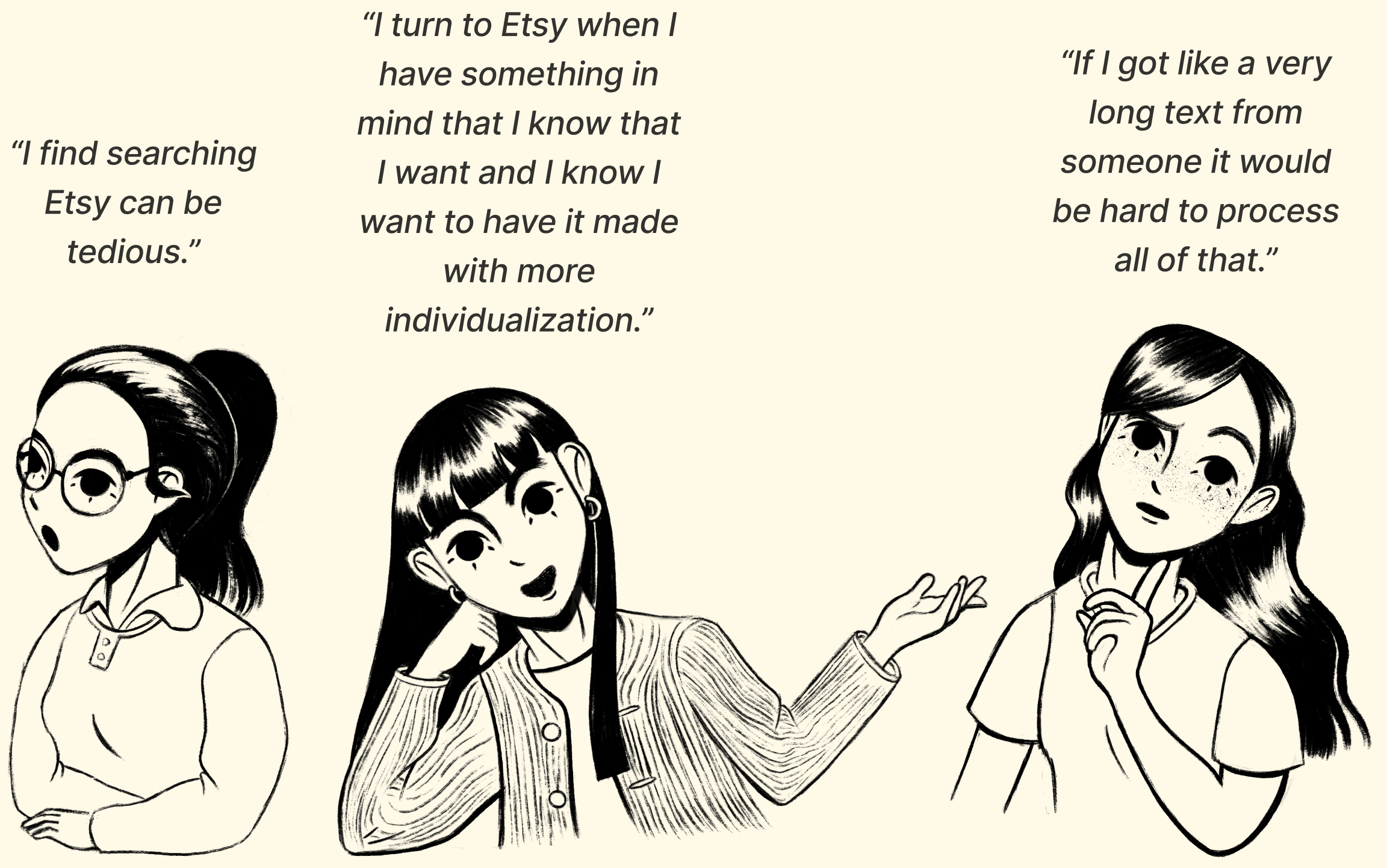
Here’s some direct quotes we pulled from our user interviews we thought represented some of the the main pain points.

Main Takeaways
Etsy’s search and filters aren’t intuitive for the user to use, Etsy’s strengths of unique handcrafted goods is also a pain point and is incredibly difficult to organize into digestible information architecture
The majority of full time Etsy’s sellers value time and efficiency above all else, they have to juggle social media promotion, running a shop full time, and having clear communication when discussing a buyers customization request
Etsy’s is already known as a destination for customization, however the current process has no structure or consistency
Problem Statement
Etsy buyers need an efficient way to find relevant vendors and communicate their customized request in order to make the commission process clearer.
Low-fidelity Wire frames
Once we were able to identify the two main users and pin point their challenges and goals, we jumped right into creating low-fidelity wireframes for our first design iteration. At first we struggled with wrapping our minds around how we’d create a site that caters to two very different users. But made a comparative analysis that took a closer look at fivver, task rabbit, Facebook marketplace, Alibaba and Uship.
Search for Vendors
1) This is a list of all the available sellers that buyers would be able to carefully look through. They’d have to options to either peruse the sample images, the reviews, their expertise tags, as well as multiple ways1 to directly get in touch with them about your project request.
Vendor’s Etsy Shop

1) A direct way for Buyers to reach out to the Seller
2) If they’re unable to find a suitable Seller for their project, they can post a request instead and Sellers will reach out instead
3) The shop’s products displayed with jepgs
4) Shop reviews that buyers can read to help form an opinion on whether or not to reach out to this Seller
Make An Appointment With Seller

1) The option to make an appointment with the Seller
2) Buyers can schedule an appointment with a Seller if they want a one on one initial meeting about their custom project
Message The Seller

1) Buyers have the option to also directly message the Seller
2) Text box where Buyers can write a message and start a conversation with a Seller
Search For Buyers
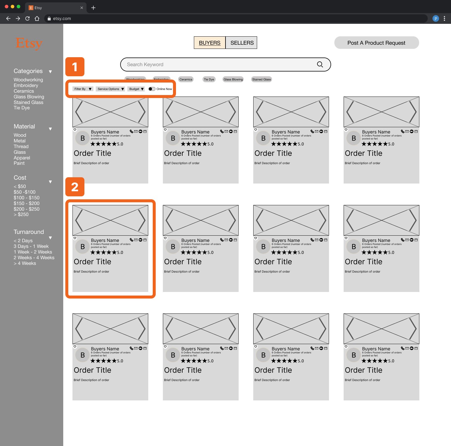
1) A horizontal filter to help users filter search results
2) Buyer’s card that Sellers can evaluate and determine if they want to work on this person’s custom project
Buyer’s Request Form

1) A request form that Buyers can fill out for their custom order requests that Sellers will see
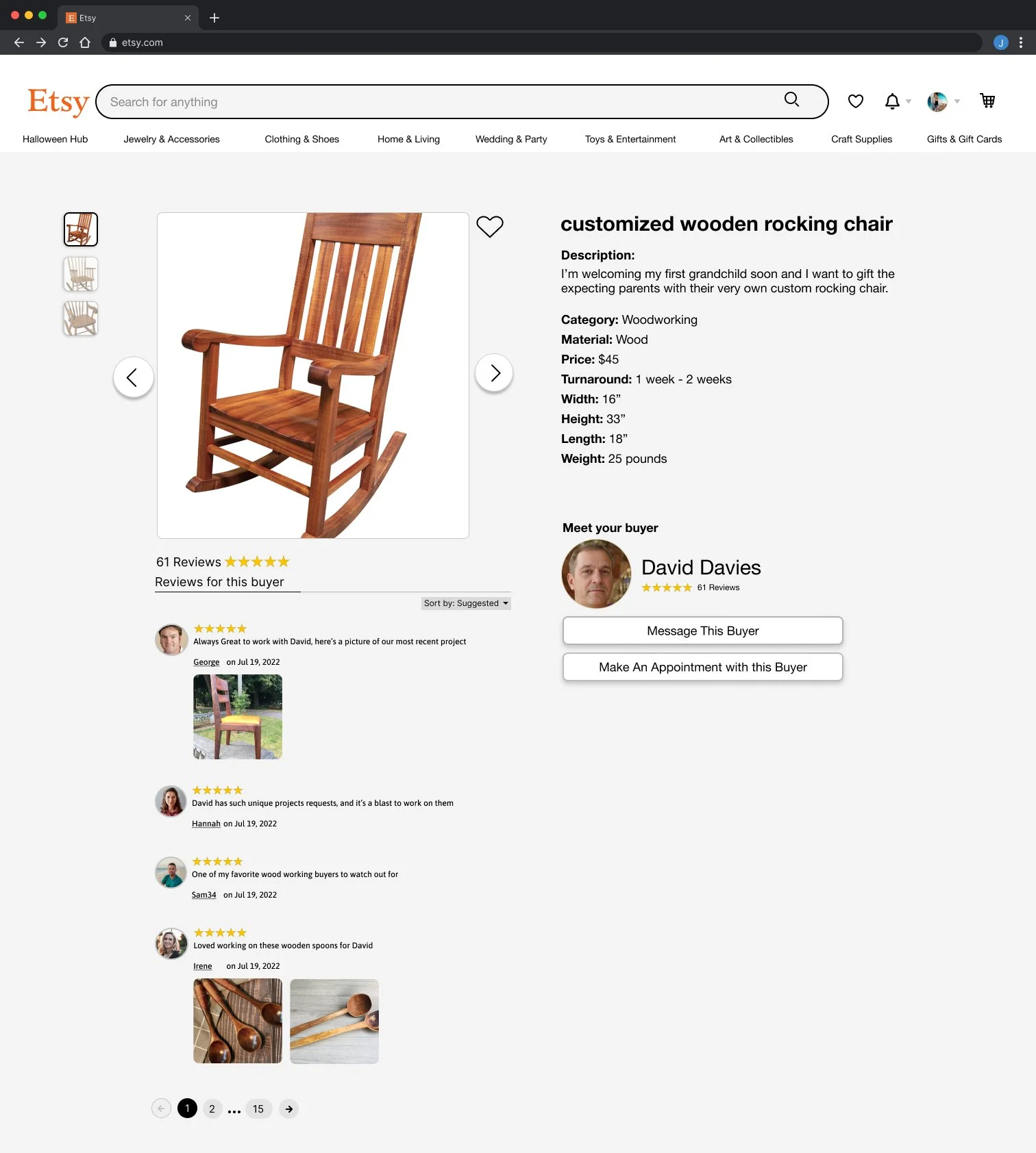
Buyers Custom Order Page

1) Samples images of the Buyers custom request
2) Order description provided by the Buyer
3) Reviews on past Sellers who’ve worked and collaborated with this Buyer
4) The Buyers information, as well as options to directly message or book an appointment with the Buyer
Main Takeaways:
Having a straight forward direct way to connect with the artisan to explain your customization request
A standardized way for buyers to explain the main points and wants of their request
A way for buyers to directly search for qualified artisans

Usability Testing
We thought these kinds of features would structure the process and create a easy, obvious way for sellers and buyers to connect. Once the wireframes were completed we proceeded to taking the images and placing them into the maze app. Here, you can create your usability test and include things like open questions, rating systems and multiple choice questions in between the user tasks.
Here’s some of the results we got back.
Task 1: Locate a seller you’d like to connect with, and book an appointment time with that seller.

Even though users were able to locate the vendor we tasked them to find, it was interesting to see that 27% of users automatically went for the search bar when trying to search for a vendor.

Unfortunately, this screen wasn’t as intuitive as we had hoped. There were still users that tried to interact with the images of the shop’s products and the reviews.
We discovered that it might’ve been because of the UX language we chose. There’s “message” a vendor and “contact” a vendor, which we thought was a clear way of letting users know that this is where they can book appointments. Clearly it was confusing, and we decided to change the button to “make an appointment.”

Overall this screen was pretty straight forward for users to navigate. They had to finalize an appointment with a vendor, and this task had a success rate of 82%. However, there were a couple of users that had a very frustrating time with this screen.
Main Takeaways
We needed to rethink the calendar screen if 72.7% of user gave up
UX language for the contact buttons needs to be changed to “Make an Appointment”
Overall testing went well
Task 2: Locate a buyers custom product post, then directly reach out to them ad let them know you’d like to and are qualified to help them with their project.
The buyers portal preformed pretty well with a 20% mis-click rate and with an average 6.5 seconds spent to progress to the next screen. Regardless, there was still a few users that intuitively chose to use the search bar first. But overall, our team felt confident that the screen was overall easy to navigate.

This screen had an even lower mis-click rate of 10%, and users spent around 5.9 seconds on this page. However, we recieved direct user feedback informing us that the language “Message Buyer” vs “Contact Buyers” was confusing and seemed like they would serve the same purpose.
Main Takeaways
Preformed better than task 1
UX language is confusing here as well, we are thinking of changing “Contact Buyer” to “Make an Appointment With Buyer”
Iterations
My group decided to come together and brainstorm how we wanted to handle our user testing feedback. We did this by spending 5 minutes to sketch ideas on our own, and then shared them with the group and discussed for 20 minutes. Once we were done with feed back we repeated the steps one more time.

Main Takeaways:
Make the distinction between the buyer and seller user flows more obvious, by tucking the sellers user flow behind a drop down menu
Change the language on contact buttons
Make the elements larger and clearer
final designs

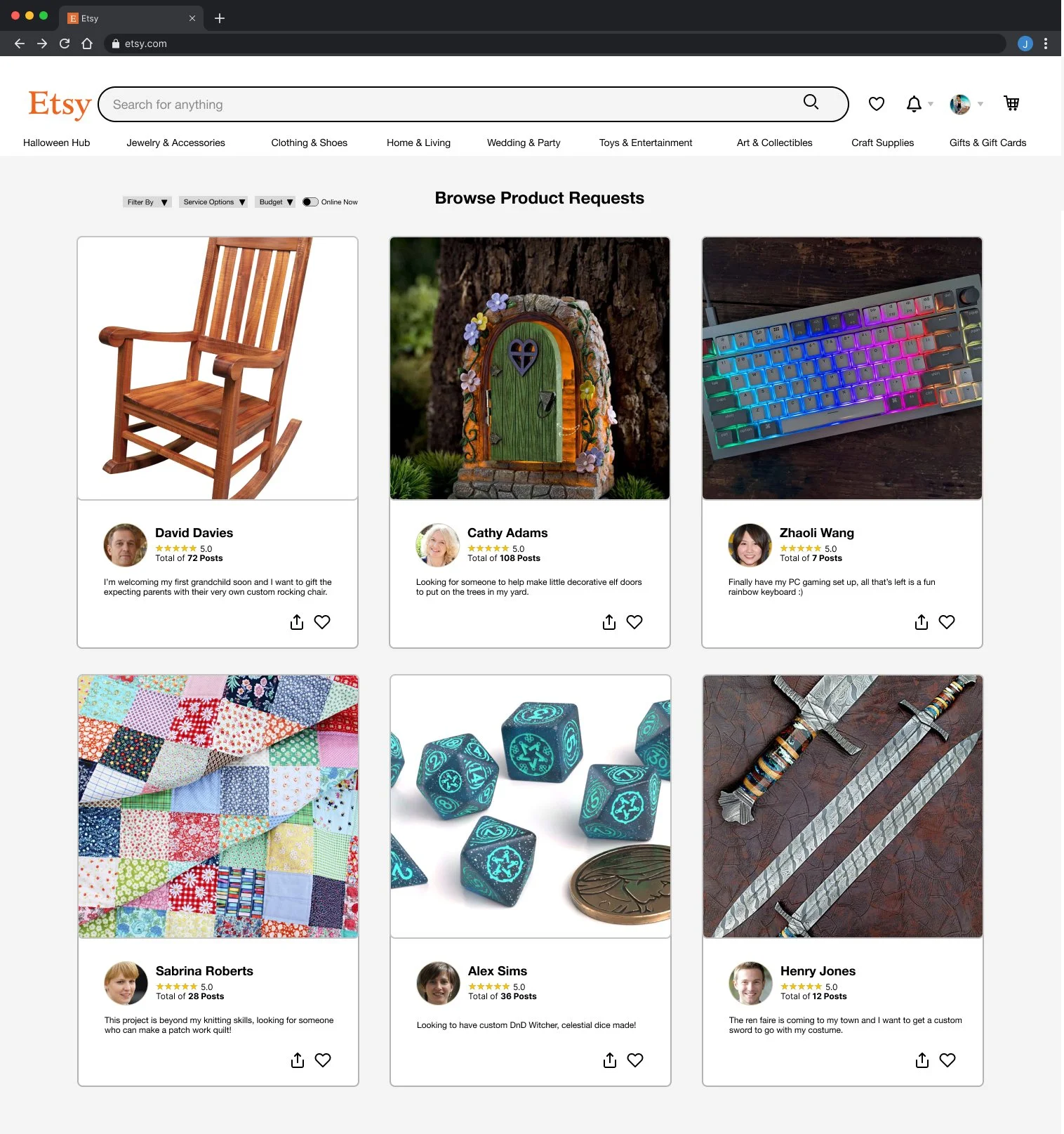
Etsy Vendors List

Browse Vendors For “Custom Pet Products”

Etsy Vendor’s Shop

Direct Message Vendor About Custom Order

Make An Appointment With a Vendor

Track Your Order After Placing Your Product
Custom Product Request Form

Buyer’s Product Requests Posts
Buyer’s Custom Product Request
My team and I started out this project trying to digest and make sense of all the information we were discovering. Eventually we realized the buyer and seller needed to have effective, clear communication above all else. Without it, it created confusion, stress and frustration amongst our users. From here we created and focused on implementing a marketplace where sellers can respond to buyer’s custom requests, and provide a separate space where buyers can look up available artisans that work with custom requests.
We also considered implementing a new navigation system, but the more and more we tried to organize Etsy’s content the more and more we realized that it would take a lot more effort, and time than two weeks. My team put the idea aside when made a priority map and decided to focus our efforts else where.
Learnings

It was incredibly fun to brainstorm and think of ideas with teammates
Taking the time to plan and agree on what we wanted to focus on ended up helping us a lot towards the end
We had to trim a lot at the start including exploring Etsy information architecture. Etsy’s limitlessness is one of it’s greatest strengths, and most unorganized mistakes.
If in doubt talk it out
Things that you think are so straight forward could actually be confusing to others
Practicing always helps
No design is perfect, there is always room for improvements