

heartnet
creating a transparent, open, honest, connection between charity and donor
Project Overview
Goal: To give users a transparent, honest relationship of how their efforts and funds are used by the non profits they choose to support.
Challenge: How to facilitate this transparent relationship so that users feel confident that their choosing to support non profits that align with their values and wants.
Tools: Notion, Figma, Google Slides, Google Docs, Maze
Role: UX/UI Design, Competitive Analysis, Usability Testing, Prototyping
Duration: 2 weeks
The idea behind this app happened when I worked on a hackathon and redesigned the UNICEF 360 app with my team. However, towards the end of the design challenge we realized that the reason why this app had such a terrible heuristic evaluation, and was so difficult to use was because it was never meant to be sustainable. It was designed for a one night gala evening with UNICEF’s donors, where they lined up and were assisted from start to finish while using the app. Regardless, I really resonated with the why behind this app, “that users felt disconnected from the work UNICEF was doing in the field,” and really wanted to use it to inspire my own idea where the focus would be creating a space where non profits are totally transparent with how they are using their donors funds and efforts for the cause.
Competitive Analysis
Our team decided to conduct a competitive analysis on other virtual reality experiences that were created for a non profit cause. By doing this we hoped to maybe learn something from the work and designs of others that would be able to point us in the right direction.

Coinup: Select a Charity/ Discovery Page
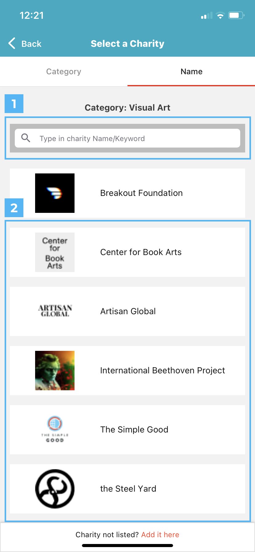
1) Provides users with a search bar so they can explore and discover new charities on their own
2) The diverse available CoinUp charity selections that users can choose to directly donate to
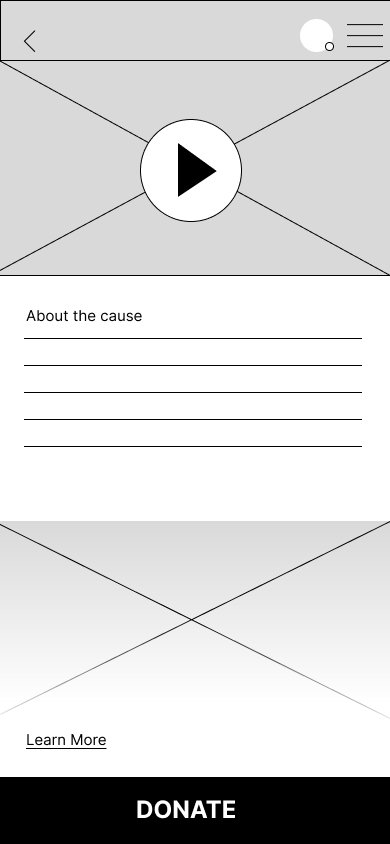
Coinup: Breakout Foundation Charity Page

1) An overview of who and what the charity is so users can gain a better understanding before choosing to commit to a cause
2) Once users are ready to more forward with a charity the next step is located as the big red button at the bottom of the screen, that’s impossible to miss
Share the Meal: Emergency Support in Afghanistan Charity Page

1) Save the Meal also provides users with an initial overview of what the cause is
2) They provide as much information as they can to the users, including an image gallery
3) As well as a map that let’s you see the cause’s location in real time
Share The Meal: Choose a Cause to Donate to

1) A tagging system to organize the different types of causes users can donate to
2) A Loading bar that shows how close the cause is to achieving it’s ideal goal
3) UX language “Donate Now” more proactive than just “Donate”
Looking back this should’ve been obvious, but just from data alone we know that virtual reality is incredibly effective when used to create empathy and makes donors donate more because of it. So these types of apps and experiences are used mainly in donor event situations where the app is design specifically for this one night, and users have attendants helping and guiding them through the whole experience. It’s something that’s not meant to be consumed by the masses, and I really do think that’s why we ran into so many heuristic violations.
Main Takeaways:
Remember to showcase the Donate feature as much as possible, in the end it’s important to remember what your business goals and needs are because the ultimate goal is to raise money for a good cause
It’s also another important to try and attract new users to your company, therefore provide resources, current charity work and ways for them to get more involved
The VR experience itself should probably be guided and hands off, this way users don’t have to learn any additional controls or instructions
Comparative Analysis
We also agreed to conduct a comparative analysis, to see how other non profits outside of UNICEF’s scope handle organizing information and creating empathy. We specifically took a closer look at the Big Brothers, Little Sisters program, the YMCA, and the Children’s Defense Fund.


1) An update from a Patreon creator
Kickstarter creators will provide users with updates about the process and share what’s happening on their end with the product. Because of this candid transparency it promotes confidence in backers.

1) The individuals who created the kickstarted
2) Their name, amount of projects they’ve backed, location, and their join date
3) Biography and website
I liked how Pateron kept the focus on the Kickstarter project itself by minimizing the amount of personal information and individual interactions. It creates a strong hierarchy, and makes the user prioritize the creation.

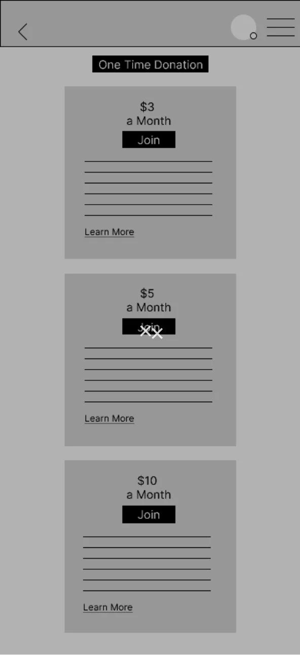
1) Pateron’s tiered memberships to their exclusive content
I thought bringing in a feature, like Pateron’s tiered membership, would compliment charitable causes. The rewards could be things like getting a personal shout out when your donation was used for something to help the charity, for polls, prizes, behind the scenes etc.
Main Takeaways:
From this analysis it also seems to align with some of the data we gathered from the competitive analysis, which is to prioritize the goal of receiving donations and make it prominent of the screens hierarchy
This analysis also demonstrates how vital it is to make it easier for users to learn more and get more involved with the organization
Most of these act as a place of resources for either donating time or money to support their cause, interaction between the companies and users through these interfaces seems pretty low
Low-Fidelity moderated usability testing
Homepage


My home screen tested quite poorly with a misclick rate over 80%, and it took users on average a minute to figure out how to move past this page. I also got to see first hand each and every participant immediately click the box representing a jpeg. There was just no denying the facts, and it was truly telling how much I was still holding onto ideas from the original hackathon. Moving forward I knew I needed to figure out a way to empty my memory and give Heartnet the new slate it deserved.
Cause Homepage

This particular task was designed to have users follow the user flow through learn more and eventually create an ongoing donation. However on top of being hard for users to see in general, users felt the language was misleading. “Learn more” made them think they were going to read something additional about the cause, not to donate. Besides, the giant donate button was so much more dominant that it felt silly to have the learn more at all.

This screen actually was one of the better preforming ones. Users felt it was relatively straight forward and on average rated it’s difficulty 2/10 (10 being the hardest.) It was also recommended that the final iteration have distinct prizes and perks that came with each tiered membership, similar to Pateron.
Mid-Fi Moderated Usability Testing
The lo-fi usability results were quite eye opening. Especially with how much bias I was still holding onto. So I decided to completely cut all ties and go back to my comparative analysis to take a closer look at Instagram. I thought if I tried to lean on more traditional social media UI that it would make tasks overall a bit easier for users to learn quickly.


Overall this screen tested well with a 97% success rate, and users spent less than 5 seconds moving onto the next step


something I made sure to add to this screen was effective UX language to lead users to the ongoing donation option. For the most part, users were able to navigate this screen with relative ease and spend less than 5 seconds on this screen as well.
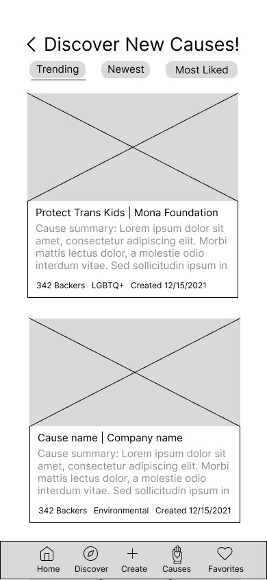

Adding a discovery page felt like it really helped users see what kinds of causes there are to donate to. It also made 3 out of the 5 users ask about the possibility of a way to introduce the app to user at the start. It was completely un-prompted, and made me consider adding an on boarding process. In my competitive analysis, I saw that Coinup and American Red Cross both included on-boarding processes with their apps. I was on the fence about it before, but direct feedback like this made me want consider adding this feature to my hi-fi prototype.
I think this round of usability testing went much better than the previous. Most of the tasks were completed with relative ease, and Heartnet go an average difficult score of 2.25/10. I felt pretty confident going into the next round of iterations.
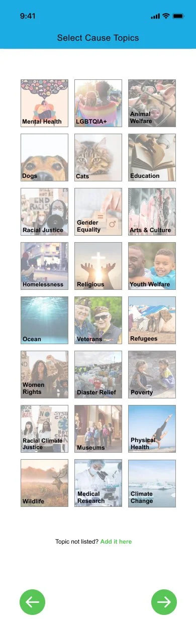
Final Designs
Your Activity
Discover New Causes

Create a Cause

Settings

Homepage

Ongoing Donation

Save The Turtles! Cause Page

One Time Donation

Hamburger Menu

When we first started our hackathon our only constraint was it had to be about a charity or a non profit. From there my teammate Hannah suggested we take a look at UNICEF because it was one of her favorite non profits. From here we stumbled upon the UNICEF 360 app, and “the why” behind it got me immediately hooked. I was also so fascinated with how Idea Studio utilized virtual reality to create powerful empathy.
This was all of our first ever hackathons, and something we can all agree on is the time constraint was so stressful. Throughout the whole process our instructors kept reminding us that this was suppose to be fun, and it’s not about finding the perfect all size fit solution. Thankfully, towards the end we were able to let go just enough to actually have a good time.
Learnings
Chill out! Remember the end doesn’t happy to be a “happily ever after,” it can be a “to be continued”
Sometimes the process is going to get messy, just roll with it the best you can
Don’t be afraid to call out teammates mistakes (but don’t be rude about it)
It’s nice when you can really connect with the why behind something