
Kids on bikes
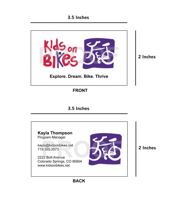
Kids on Bikes is a non profit based of out Colorado Springs. Their mission is to get kids outside and engaged in their communities, on top of that, they also operate a pedal station where people can donate old bikes that they fix up and let kids use for free. When we first began our collaboration, they didn’t want any of the graphics changed, but they felt like their business cards just weren’t as effective as they could’ve been. After conducting 5 user interviews with designers the main point of feedback was if they want to make the business cards more effective, than they should consider the orientation of the information on the card and how much space it has to breathe.


This one the first option I presented to the client, and used their repeating icon pattern, logos and arial type. The main things I changed were the size of the icons in the pattern, as well as the orientation of the information on the card.
In the second option I did my best to just create something straight forward that would meet their needs and wouldn’t be complicated to print. I tried to use the same layout that option 1 used for it’s back, this way it’d be consistent and effective.