
The Chisholm Legacy Project
ORGANIZATION IS vital FOR MAKING INFORMED ENVIRONMENTAL DECISIONS
Project Overview
Goal: Create a search system that matches users to relevant search results on the TCLP resource hub.
Challenge: How to create a search system that doesn’t overwhelm and confuse users so that they can find resources that are relevant to their needs.
Role: Scribe, UX research, UI design, Prototyping
Tools: Figma, Notion, Google docs, Zoom
Duration: 2.5 Weeks
The Chisolm Legacy Project Resource Hub's core mission is to support racial climate change justice and Black femme leaders. TCLP executes this mission by providing them with diverse resources to make informed environmental decisions, that will impact them and help their communities to advance system change centered on equity and justice.
The goal for Resource Hub is to make resources easily accessible, easy to find, and sort. The current information architecture of the site is organized by types (text, audio, video) and topics. However these two main categories aren’t sorting and filtering the information in a way that is relevant and helpful to the users.
Road Block

So ready!
We’re gonna crush this!
Let’s go!
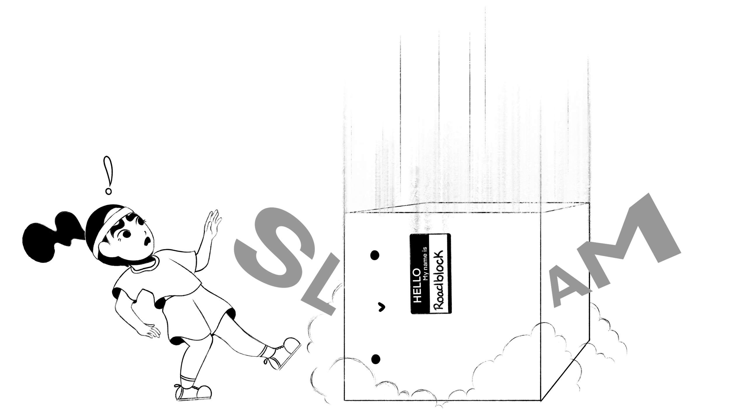
After we had our initial meeting with our client we felt like we had a solid grasp on what our goals and challenges were, and knew that they wanted us to prioritize the information architecture of their search system. However, as we were going over the notes we realized that a lot of Kara’s answers contradicted each other.
“The whole website is the resource hub”
“We want to provide the necessary resources to help BIPOC fight against the environmental racism in their communities”
“Oh this is our resource hub tab”
“Our main goal is to attract new users and improve our retention”
Main Takeaways:
We were going to only focus on the homepage and resource hub tab
Even though their main audience was in on helping BIPOC users, they wanted to attract as many kinds of users as possible
Our top priority is to make the filter and tagging system more intuitive for users to help refine their searches
Heuristic Evaluation
Once we were ready to start on the research phase, we decided to start with a heuristic evaluation. This way we could explore the website and gain a deeper understanding of how exactly we could improve the overall experience and meet users needs.
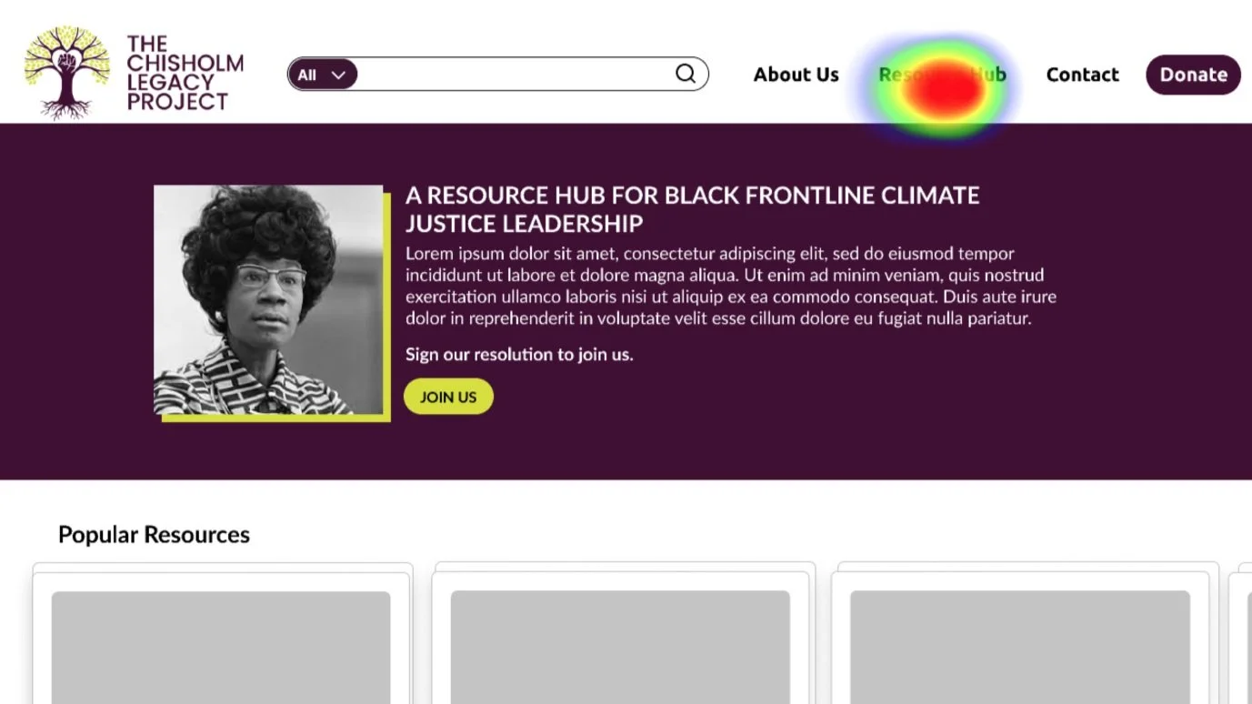
TCLP Homepage
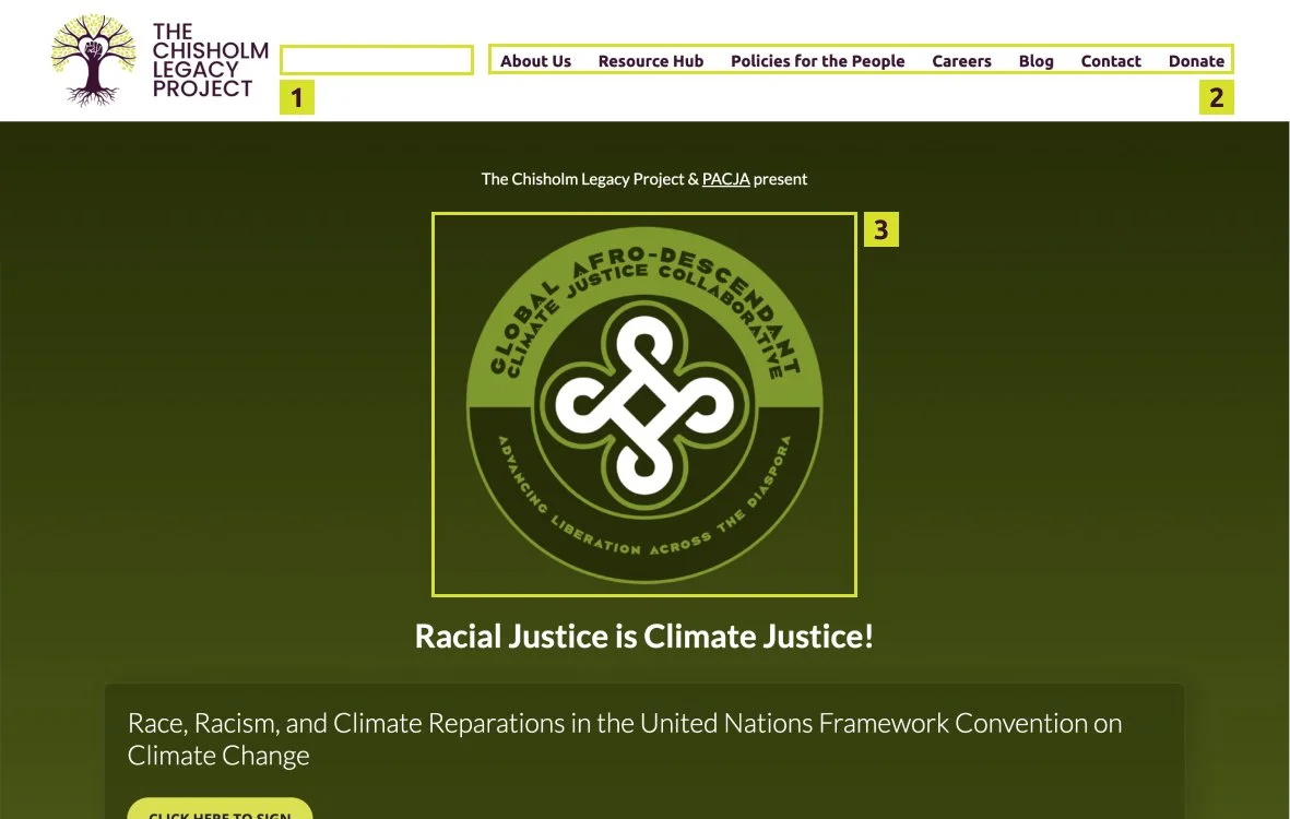
1) Website didn’t have a way to search site
2) Our first impression was the amount of navigation tabs seemed high, maybe we could merge some of the tabs together?
3) An unknown logo is the largest element on the page and is in the center

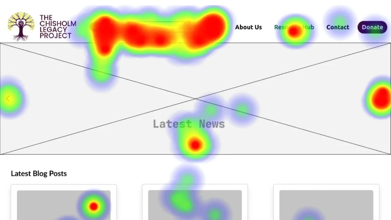
1) Information is repeated in the text filters located below
2) This is the official search bar for the resource hub and it’s small and tucked away to the side
3) Even though the filters are one of the main ways users can refine their search, they’re only allowed to select one filter per search
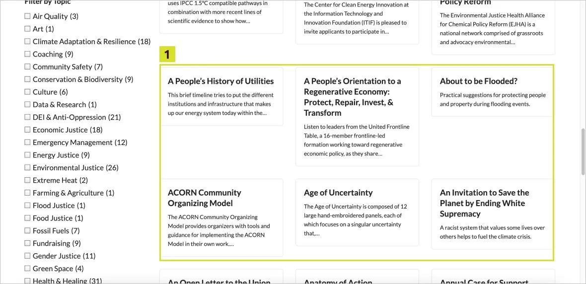
1) Lack of size consistency with the resource cards
Main Takeaways:
The homepage was filled with the awesome work TCLP accomplished at COP26, however we noticed that users kept assuming that the logo on the main homepage was TCLP’s logo and it kept creating confusion
The search bar that was meant to help users search in the resource hub was tiny and often went un-noticed
Not only were their resource cards only black and white text, they were also all different sizes
Competitive Analysis
Our team decided to evaluate other non-profit online resource hubs to see how they handled organizing their large amount of resources. This way we would be able to compare and contrast TCLP with other resource hubs and maybe learn of new features that could help TCLP achieve it’s goals.
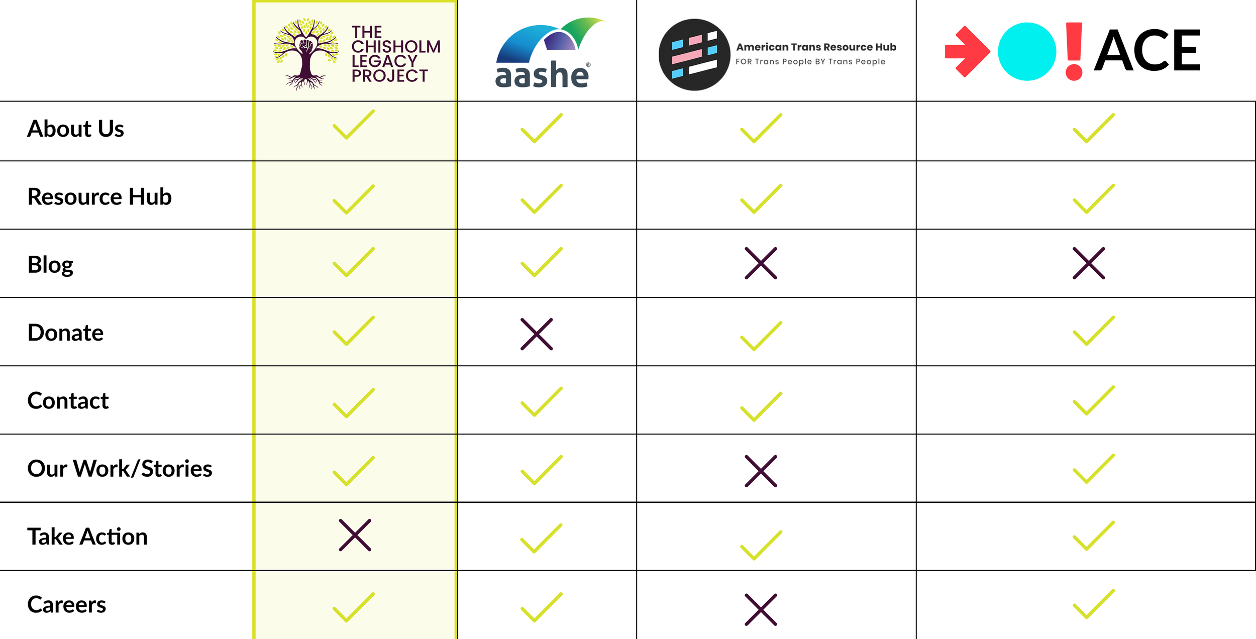

1) The logo of the non profit and what their cause is
Main Takeaways:
Homepage has clear company logo and purpose of the non profit
These organizations showcase the field work their doing
Comparative Analysis
Next my team and I decided to continue researching and learning by conducting a comparative analysis. We chose to focus on information architecture, specifically on organizing vast, diverse products. So we decided to compare TCLP to Amazon, Target, Barnes & Noble and ebay, which we thought were solid examples of a search systems that handle a lot of different items.
1) A search bar that’s either above or aligned with the navigation bar
One of the main things we noticed each company had was a centered, dominant search bar that allowed users to directly type and search whatever they wanted.
At the moment, TCLP didn’t have a overall search bar for their site at all, and the one in the resource hub itself is tiny and tucked away with the search filters. During our first maze usability test one of the main pieces of data we collected from our users was how the majority instinctively used the search bar to navigate through the resource hub.

1) Target is suggesting top gifts that users can save money
2) Christmas themed suggestions
3) Suggested categories for Christmas gifts, as well as how much money users can save
1) A 30% sale
2) Highlighting a possible purchase
3) Mystery thrillers with the book cover, title and customer reviews
Main Takeaways:
Consider implementing a more prominent search bar to the TCLP website
Break down the diverse and overwhelming resources into possible digestible suggestions for users to explore
Visuals are much more eye catching than having results be all text like TCLP currently has
usability testing
After we had spent the time to collect and synthesize our data, we moved on to actually testing our implemented suggestions and features. We did this by using the Maze app to create an online usability test that we could share by copying the link. Going in we wanted to make the website’s purpose clearer, implement a consistent resource card size with visuals, as well as giving the resource hub a more engaging and enticing interface.
“To provide resources to folks about environmental racism and/or racial climate change justice”
“Resource Hub”
“To teach people about climate activism through a lens of racial justice. ”
It’s already been mentioned how the lack of context on the home page was disorienting and confusing for users, so we tried to remedy this by displaying their tagline and mission statement front and center. We were pleasantly surprised by how quickly our users were able to tell the purpose of the site itself because of our changes.
Another feature we wanted to test out was our idea for a drop down menu within the search bar. We thought by placing it within the search bar, it’d make navigation and refining results even easier and more fluid. However this our usability test showed us that it only caused confusion amongst our users, and even though it was thought to be creative and unique it was hard to use without instructions.
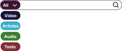
Close up of filter system within the search bar
“The drop down menu in the search bar feels unique but it’s hard to figure it out. ”
“maybe change up the search bar. I dont understand the video/audio dropdown thing... ”
So even though we thought that this feature was going to be a game changer, it turns out it changed the game too much. So we’d have to take a step back and think of another direction to take that would be more familiar and intuitive for users.
Lastly, we also wanted to make sure that our consistent card sizes were tested out to see how effective visuals might be to TCLP. The visuals themselves went off without a hitch, but we ended up getting the absolute most feedback about the design flow around our resource cards.
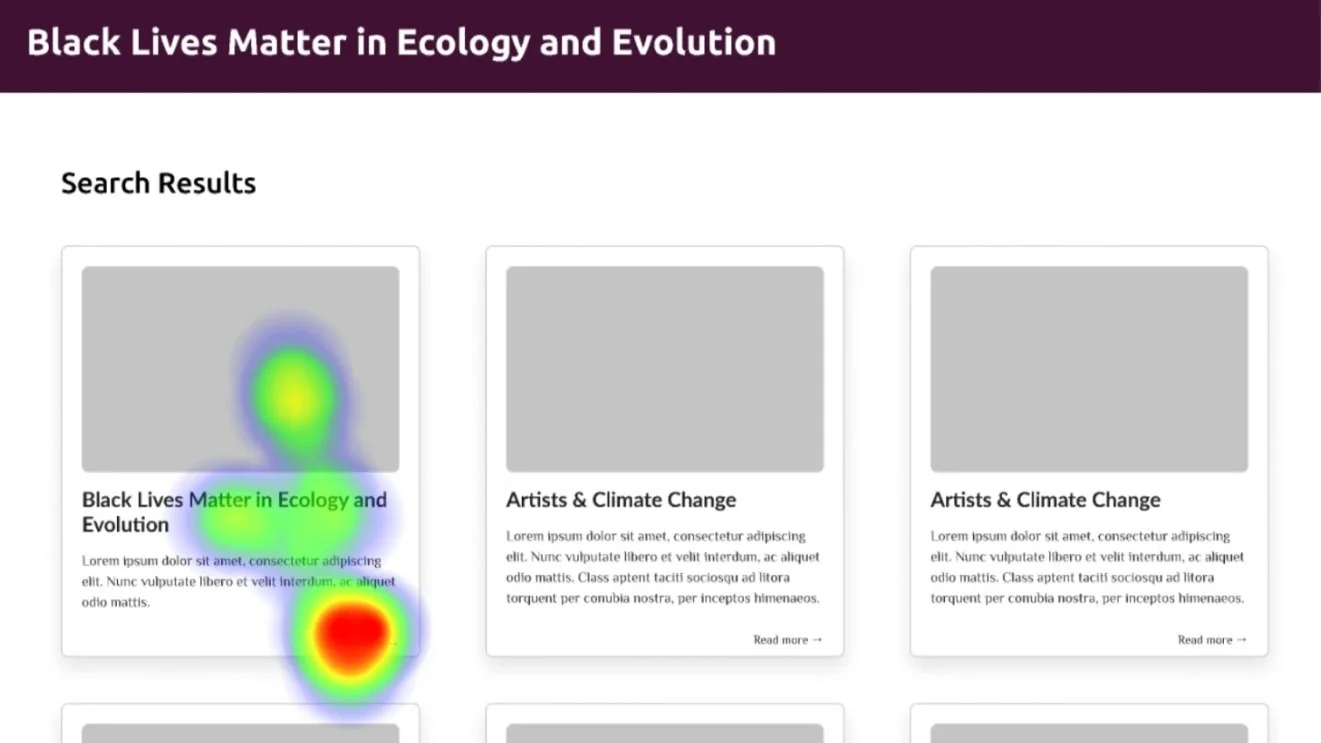
“you should also be able to just click on an entire square to open a tab and not just the tiny “read more””
“Make the cards clickable, not just the read more link.”
“I would also like to click on the entire card rather than some small learn more text”
“also I was hoping to be able to open things by clicking on the “card” (the box with info) not just the “read more” text line”
We specifically heard a lot of frustrations from our participants about the lack of click-ability on our resource cards. At this point we had designed the flow where users had to click on the “read more” text to proceed to the resource. In hind sight, this was the biggest pain point for our users and the majority of our direct feedback was telling us that the entire card should be clickable not just the “read more” text.
Main Takeaways:
The revised homepage allowed users to immediately understand what the purpose of the website was and they were able to navigate and complete task much easier
Our idea to implement filters directly into the search bar was confusing for users and wasn’t as intuitive as we’d hoped
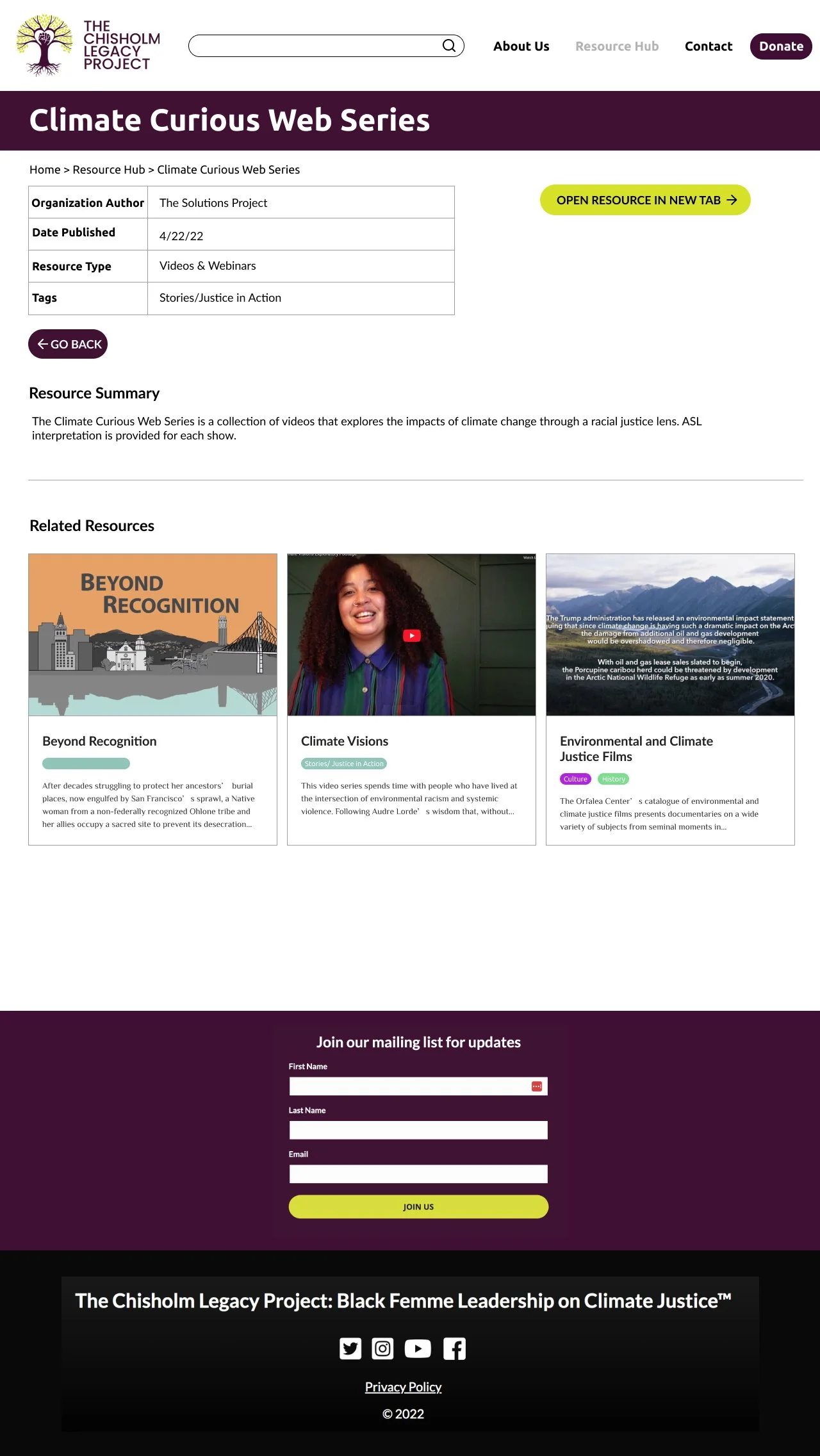
Make the whole resource card clickable, not just the “read more”
Final Designs
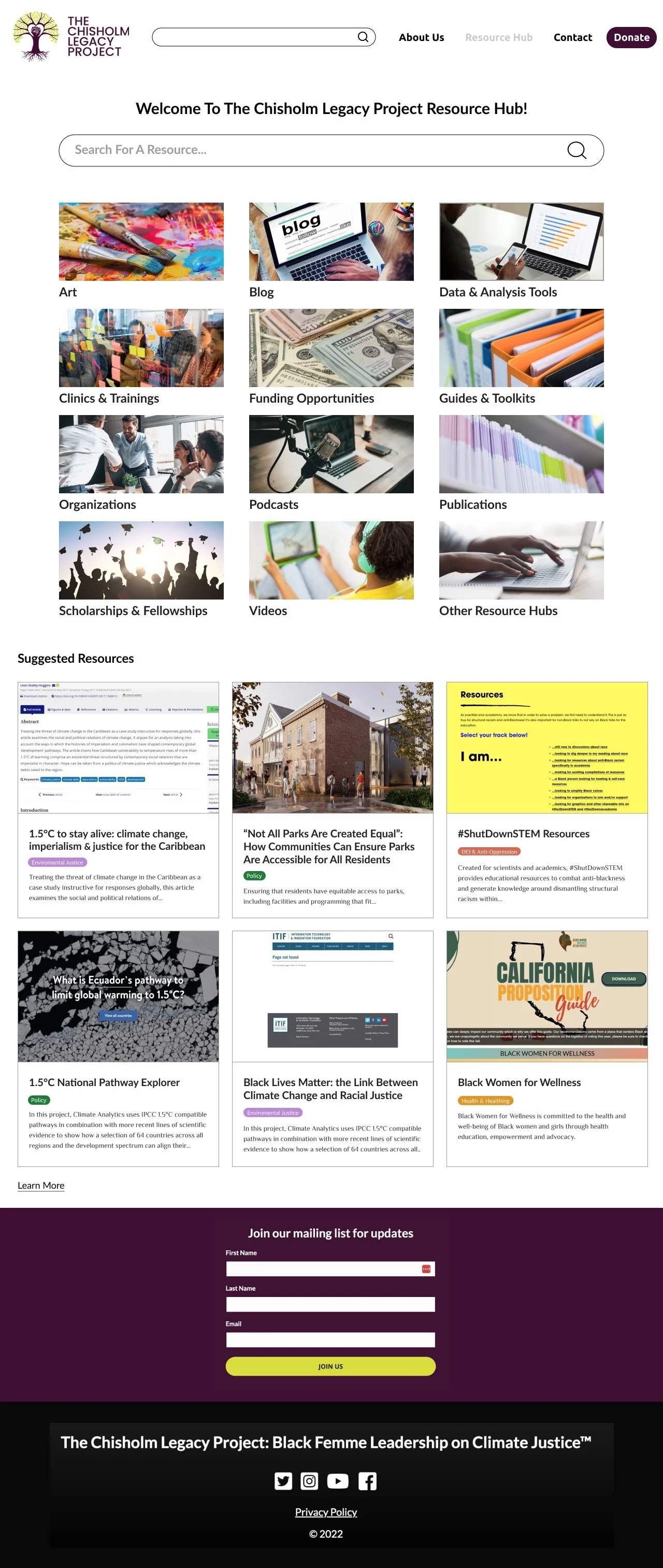
Homepage

Resource Hub Homepage
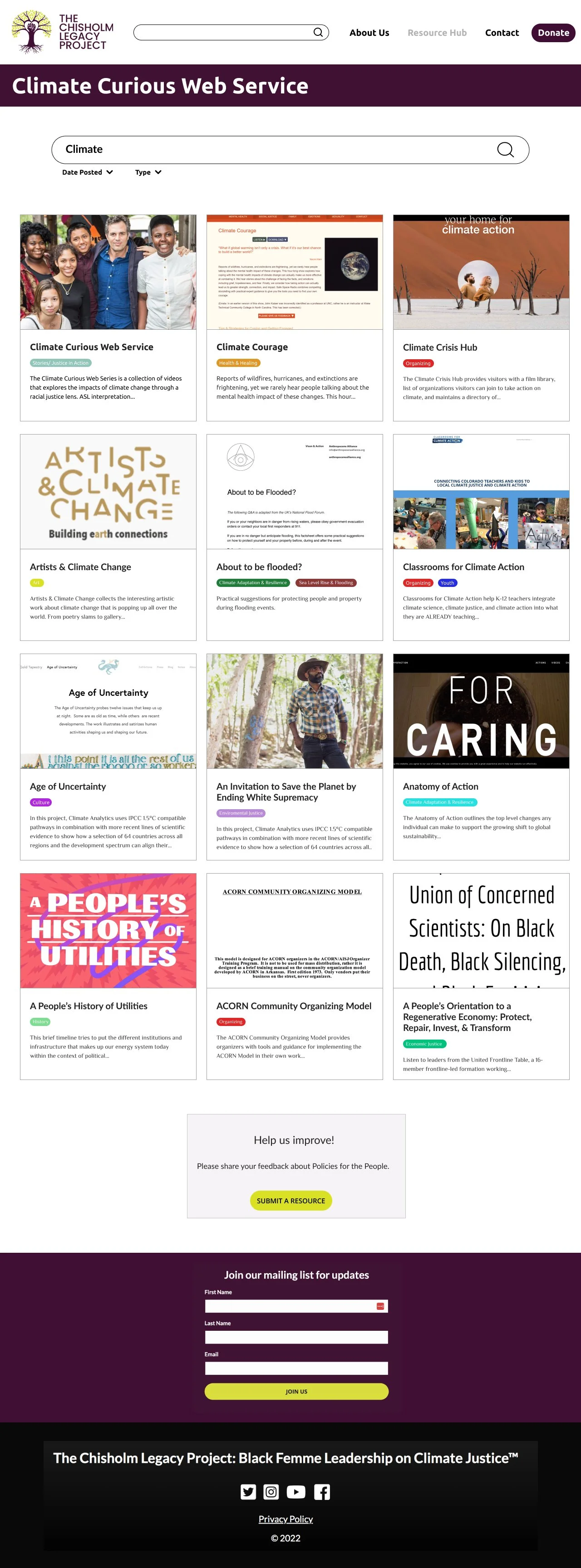
Climate Resource Search
Climate Curious Web Series
Even though we pivoted after our client told us to mainly focus on the resource hub tab itself, we felt strongly that adjusting the home page itself would benefit the resource hub as well and stuck with its designs.
Our final hi-fi prototype consists of a portrait of the woman whom this non profit it based on, Shirley Chisholm, and their mission statement. It ended up being much clearer for users and made it much easier to complete the tasks we tested them with.
The resource hub home page is relatively text heavy at the moment. We ended up learning that it was because it costed too much labor for our client to justify visuals at the moment. Hearing that was a bit disheartening, but we decided to brain storm a solution while also showing TCLP how effective the visuals were, and even though it might take a lot of effort these would be the benefits.
One of the most consistent features we saw through out all our research was a central, big search bar. While conducting usability testing we started to pick up on how a lot of our users would automatically go to the search bar, even if the instructions were directly telling them to go somewhere else. So we felt very strongly that having a search bar as a main navigational tool would help users search easier.